The Kitchen Reveal- Part I
It’s been nearly a year since I started in the kitchen, and finally, we have the reveal. The upside to designing and coordinating everything in your home individually is you get exactly what you want. The downside, at least in my case, is that you end up taking 3x as long, still have some odds and ends to tie up, and consistently backburner your own to-do list in favor of the projects you’ve been hired to manage. Oh well, such is life. I’m just happy that by the 2022 holiday season I had a space I loved, that once brought to life was even better than I could have imagined
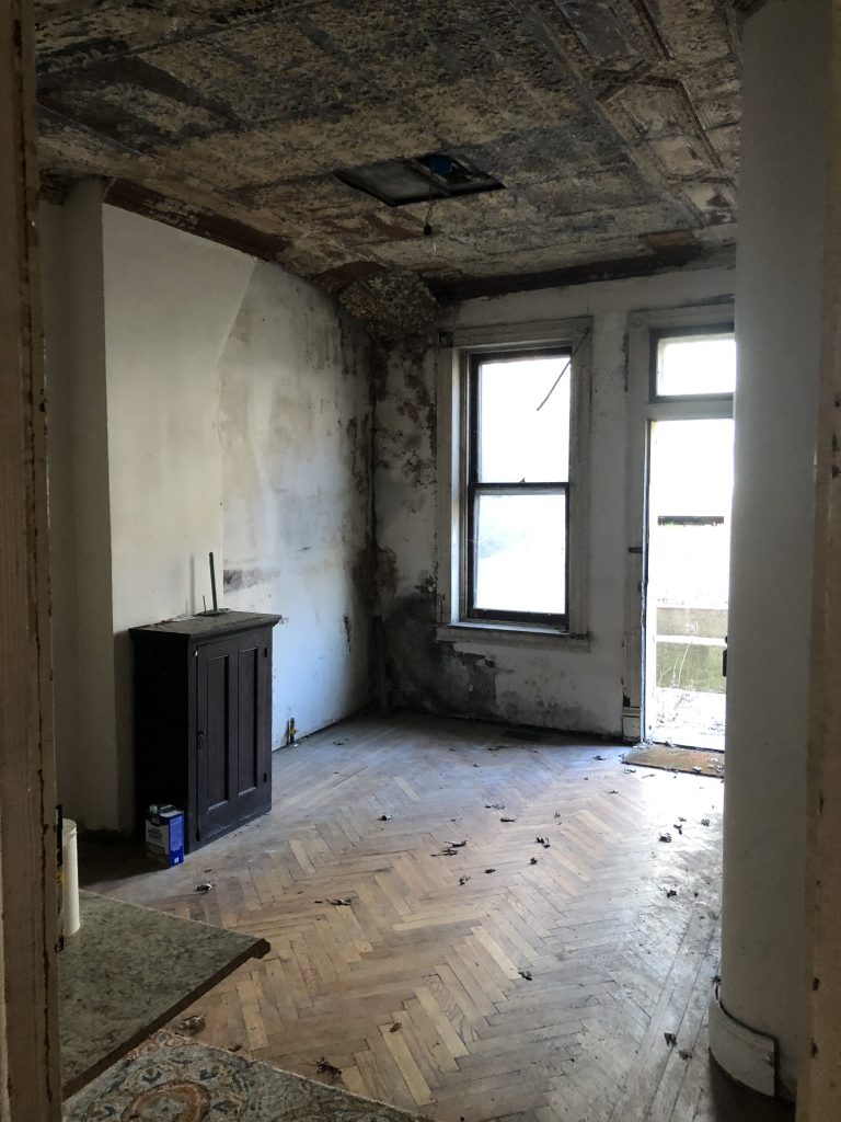
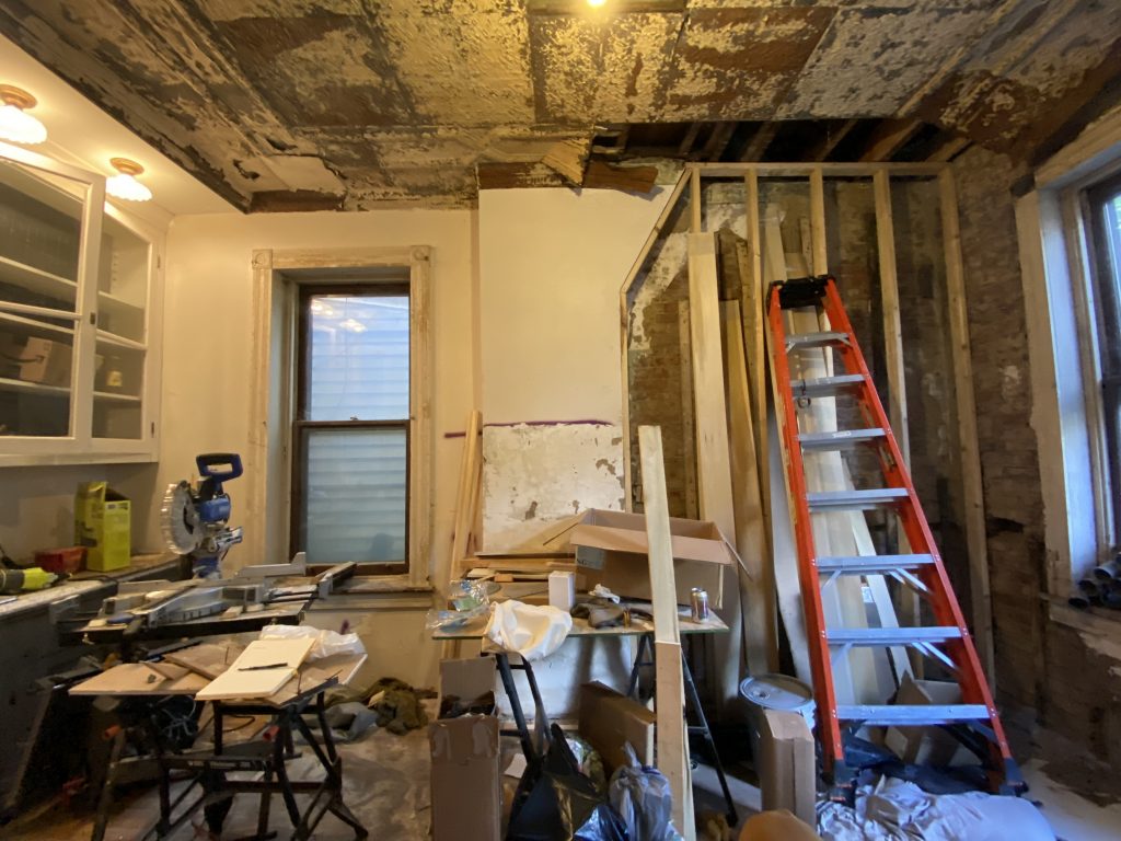
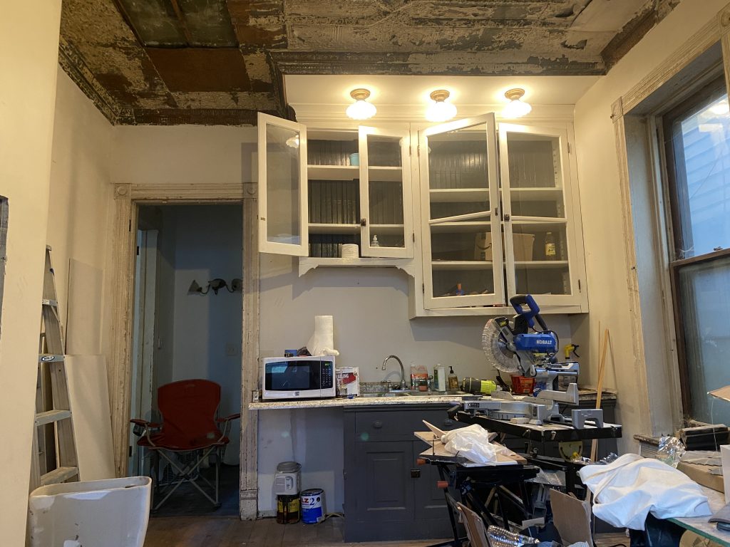
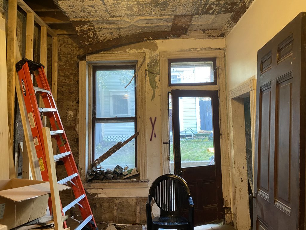
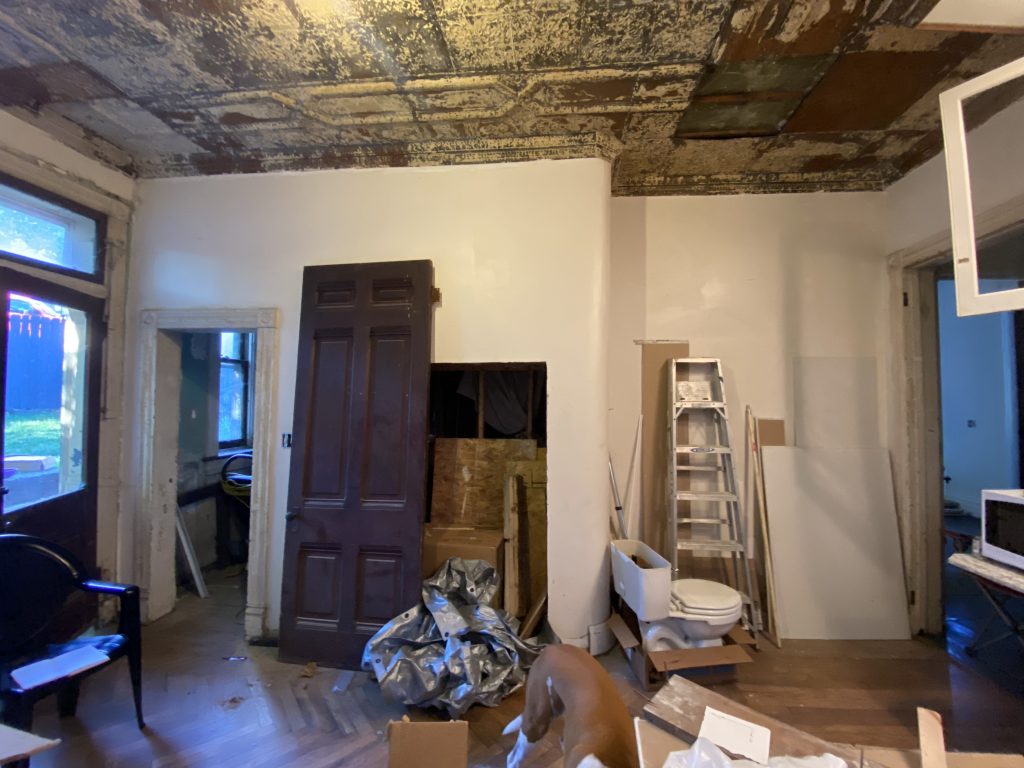
The BeforeSo let’s all refresh our memories: This is what we started with. When I bought the house in 2020, the kitchen was one of the rougher areas, with a good deal of water damage as evidenced by the walls and ceiling. A lot of this came from the missing gutters, so once we took care of that, and repointed the entire back wall, the space had a full year to dry out. Six months in we added HVAC, so the temperature was more consistent, and for a long time, that’s about all you could say about the kitchen. It had a sink, so naturally, it became a pseudo workshop.
The Layout
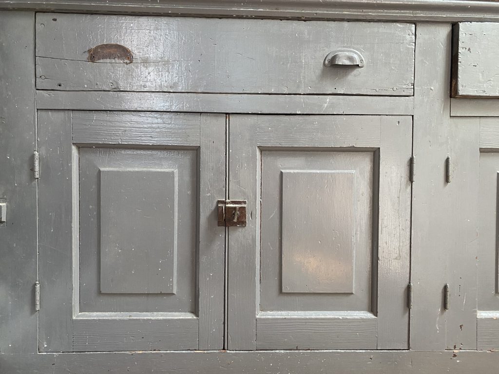
As a preservationist and someone that believes in respecting and enhancing the house you have, I knew I was not going to dramatically alter the floorplan. I identified the architectural elements in the space: The two doors, pantry doorway, two windows, and curved wall, and marked those as fixed placements. Then, I listed the furniture and appliance constraints: I wanted to maintain the perfectly good salvaged cabinets, and avoid relocating the plumbing, I needed the oven on the one wall that would allow for an easy exterior vent, and I was set on breathing new life into the old cabinet from the Butler’s Pantry.
Knowing those things were non-negotiables, I played with the layout in my head for the better part of a year. Welcoming the advice and suggestions of architects, designers, loved ones (and to a lesser extent, strangers on the internet), many advised me to remove the window facing the alley to allow for a full L-shaped stretch of windows. This was a nonstarter.
For a minute, I considered creating a large cased opening in the pantry wall, retaining the curve but fully taking over the Butler’s Pantry space. This was a plan for quite some time, until finally reality set it. I’d be taking out a usable utilitarian space, just to create a wall of cabinets. Why not just replace the existing wall with cabinets, thus maintaining the original floorplan and ever so slightly encroaching upon the pantry space. That felt right, and so I grabbed some chalk and set out to find a cabinet maker.
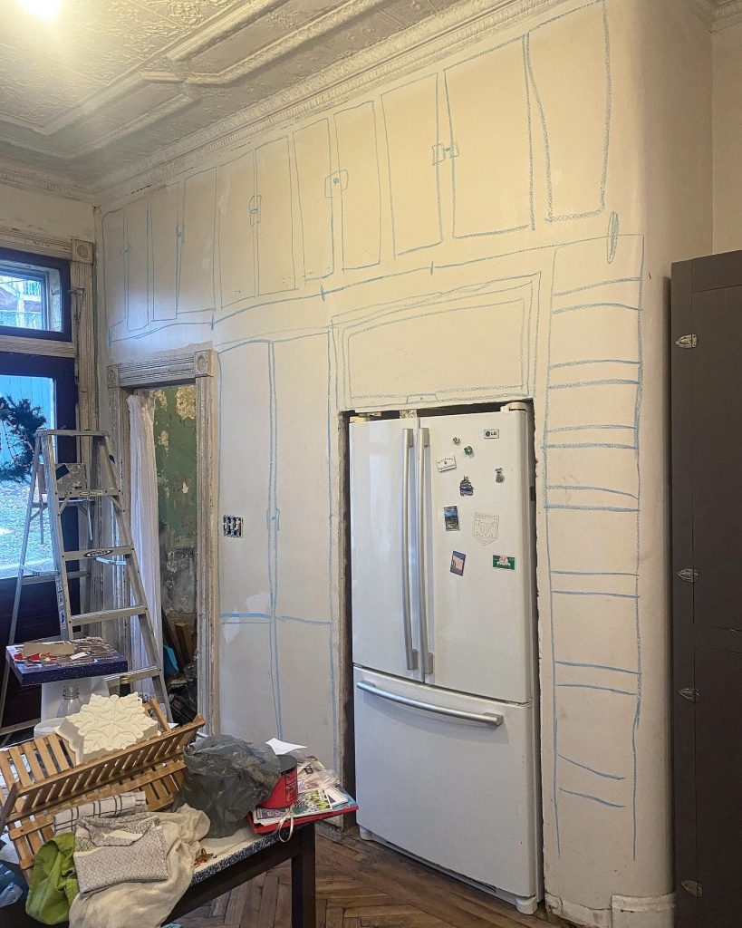
The Cabinets
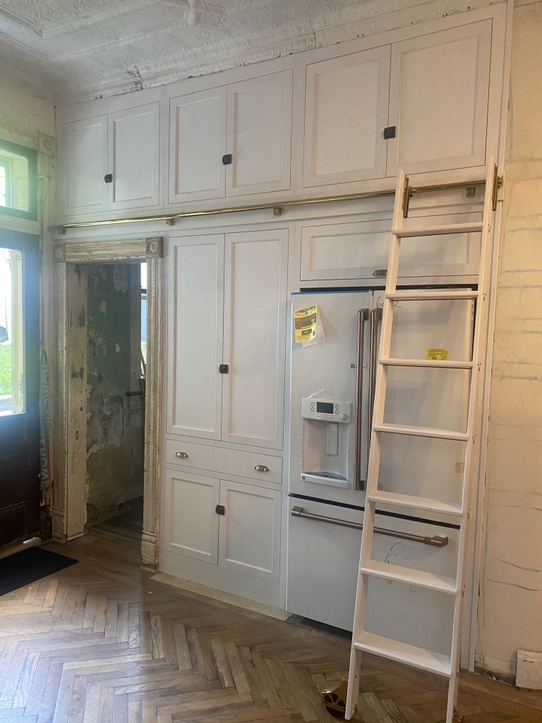
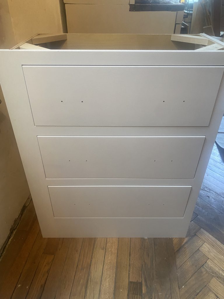
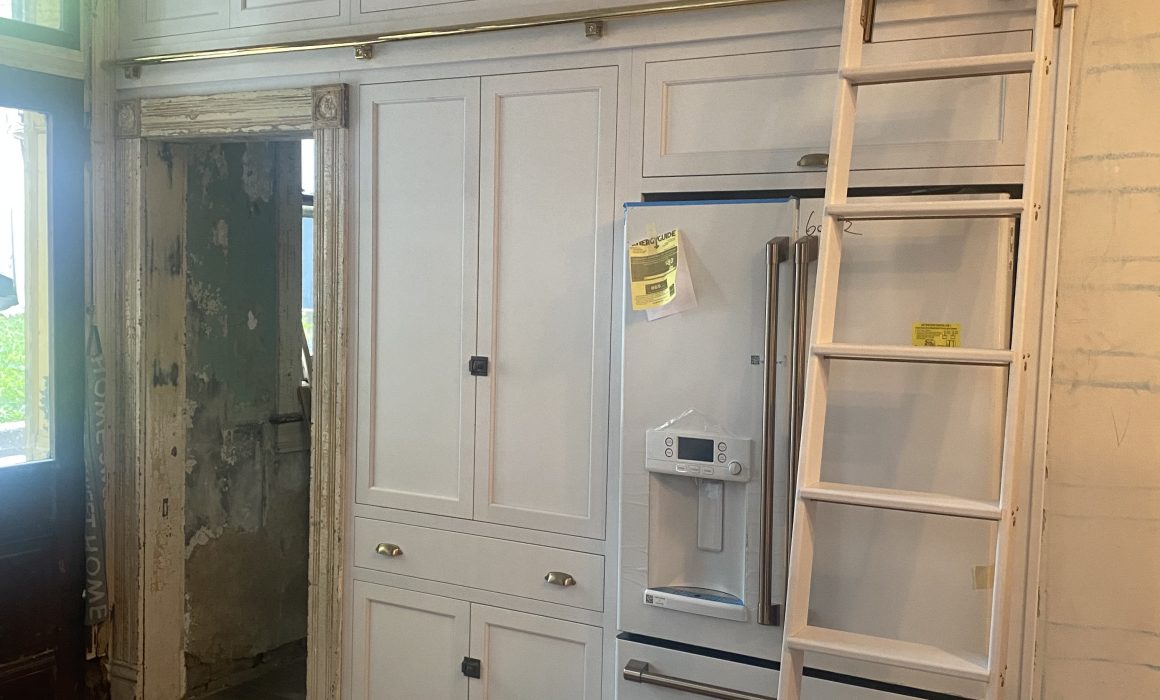
The Cabinetry in the space was a challenge, because pretty much all of my high-value, usable new cabinetry would be contained in the wall. A small three drawer set would complete the dead corner by the pantry cabinet, and that was it. I toyed with the idea of DIYing with ready to assemble cabinets, and called a few local showrooms before finally biting the bullet and calling Shutler Cabinets, a custom shop just South of Wheeling, in Moundsville.
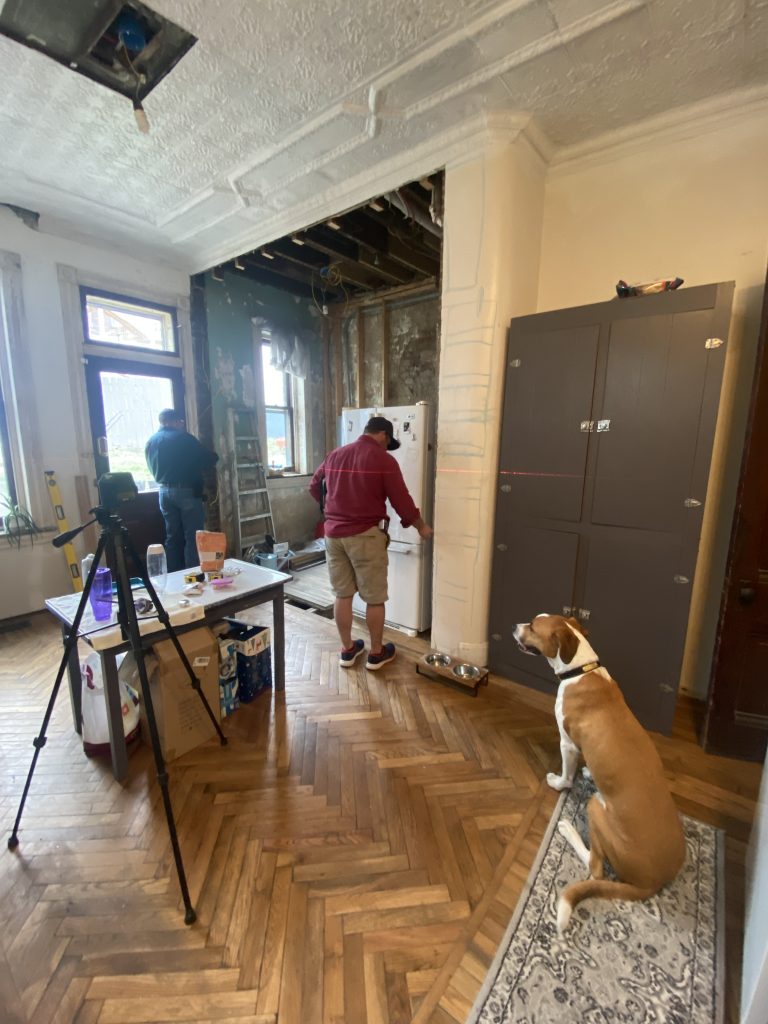
It was pretty much love at first sight for Shutler and me. Upon first inspection, after explaining all of my ideas, Dave Shutler looked at me and said, “What do you do for a living? This is not how most of my design consults go?” I explained my background and how the house had become a thing, and I immediately saw the excitement on his face. This is more of a rarity than it should be, but as a young female in this industry, my standards are more often met with resistance and even outright condescension more than they are excitement. I could tell right off the bat that Dave respected my expertise, truly cared about his craft, and would actually enjoy figuring out the challenges of the Mclain House with me. So as you can imagine I opened my checkbook and closed my eyes and the rest was history. When I went to the showroom and was asked why I didn’t bring Marshall… safe to say that only solidified my respect for the whole company.
The Design
I knew I was looking for inset doors-where the cabinet door fits within the frame rather than closing in front of it. This is standard in historic cabinetry and to me, speaks to a higher quality. The day you discover the difference between an inset and a surface mount door is the day your budget goes out the window.
We based the cabinet design off of the extant cabinets in the space. Salvaged by the prior owner, those cabinets were completely appropriate for the age of the house and likely indistinguishable from what would have originally been installed. I do have one historic photo of the kitchen shared with me by the Antonucci family. It shows their Aunt Mary standing over the sink, and while I channel her spirit often by making big Sunday dinners, I did not want to channel her 50s metal cabinets.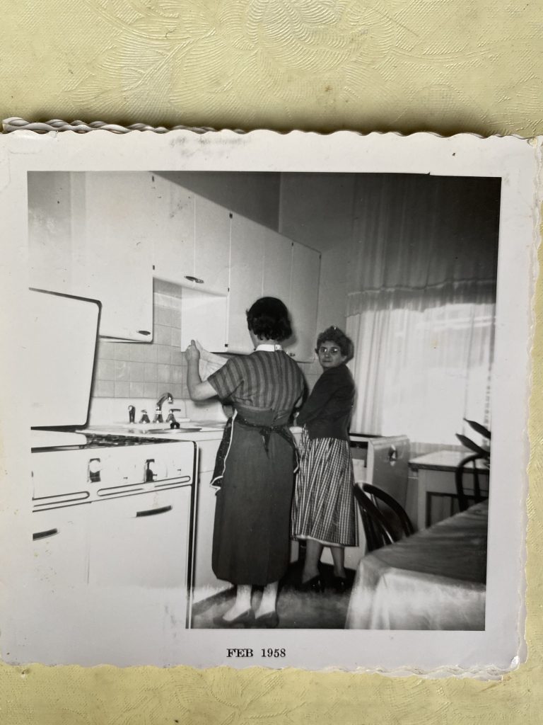
Instead, we went with totally flat panel drawers with cup pulls, and because I had several different profiles of panels happening across various historic pieces, a shaker door with a simple bevel. A panel door without the panel if you will.
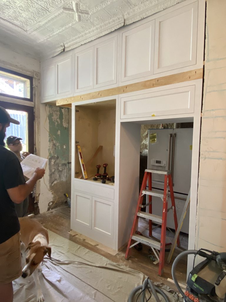
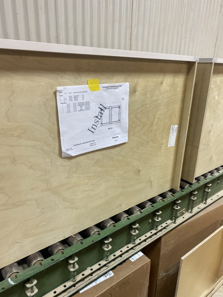
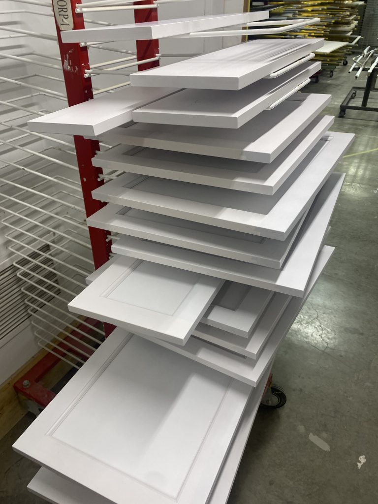
Though I was limited by the space in terms of what kind of cabinetry I could have, I can honestly say now having lived with it for several months, I got everything that I wanted. I took an inventory of the way I use my kitchen, and the products that I own, and worked from there. It’s too much to get into in this post, but one day I’ll do a rundown of what I consider to be the ultimate kitchen cabinet wish list and what to put in them.
Once the cabinets were in, I was really able to take a breath. I had some temporary appliances to use before my big shipment from GE arrived, and I spent my time considering how all of the elements in the space could work together to form one cohesive room. More on that in part II