The Backyard Mini Makeover Reveal
Let’s Talk Yards
This summer I set out to do one thing: create a retreat amidst the chaos that is the current state of the Mclain house. Why waste time on something so unessential you may ask… because mental health, that’s why.
As many of you know, the house isn’t quite livable yet. My very beautiful and livable apartment does not have any outdoor space. This drives me insane, because I love being outside, and particularly entertaining outside. That, and the fact that after a long day of working on the house, I wanted to sit outside and have a drink without being reminded of everything I needed to do not just inside, but also outside.
So this summer I worked to get one tiny section of my yard under control. This is the space immediately behind the house that would have been the extent of the yard for the Mclain House historically. Today, because the house beside me was demolished and that lot is part of my property, I actually have an enormous yard for an urban neighborhood. Someday I will make this entire area the dreamiest courtyard imaginable. But until that day, I need a small yard that makes me happy.
The Before
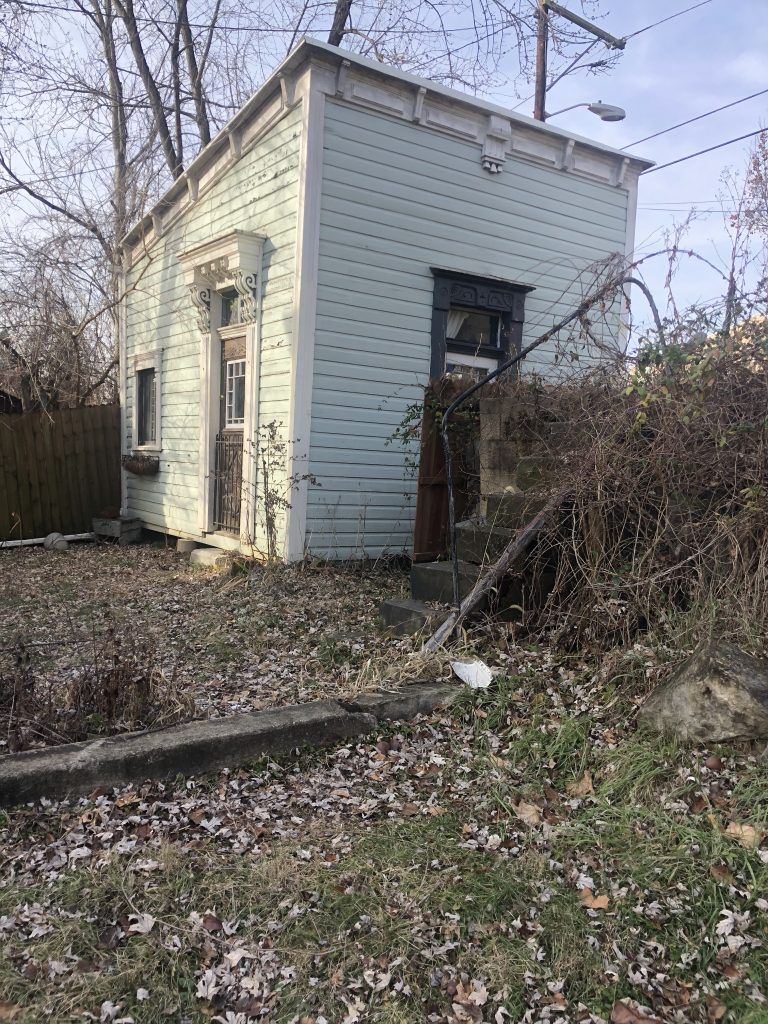
The back yard is a little awkward, with a knee-height concrete retaining wall running the full width of the space, and only set about four feet back from the house itself, The result is a kind of sunken seating area feeling that is just strange. Beyond that, there is a small grassy area, with a brick walkway leading to the mini house. And that’s really about it.
When I bought the house, the whole yard was covered in leaves. I actually didn’t know I had a brick path or a drain until Dan uncovered them. The cement area is particularly difficult, as everything runs down into this area, and leaves and sticks seem to be perpetually stuck there.
The mini house was in pretty good shape, it mostly just needed a fresh coat of paint. More than anything, I needed a fence for Marshall.

This project started practically. My first priority was to get a privacy fence up so that Marshall could have somewhere to hang out while I work, and so that I wouldn’t feel so on display in my backyard.
Lucky for me, Dan has some property across the river that he was working on, and tore down the old privacy fence that surrounded it. He also had two teenage football players working for him this summer, so they loaded up the salvaged fence, trucked it over to my place, and started putting it up. Because this is a temporary, aesthetic solution for the backyard, I had them face the fence in, so I would have a prettier surface to look at while enjoying the yard. When I fence in the whole area, I will install the panels the correct way, with the smooth side facing out.
Once the fence was up, we gave it a coat of paint to cover up its age. I chipped off a piece of the trim on the mini house, and had it color matched to paint the fence. People always ask me about paint colors, and unfortunately, nine times out of ten, I’ve either mixed my own, or color matched something in my decor. Such was the case with the fence.
The Border
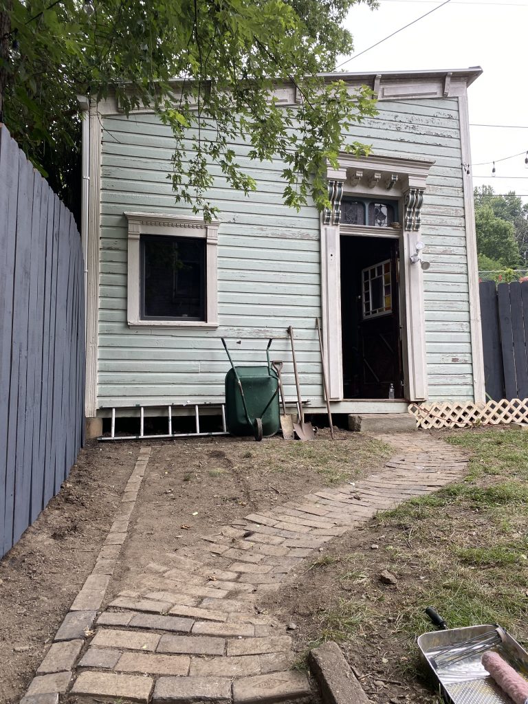
Once the fence was up, we decided to continue the brick aesthetic around the inside perimeter by creating a brick border and mulching the area between it and the fence.
Because I am a hoarder, I happened to have a pile of old bricks behind the mini house, which provided more than enough material for this project. I love old bricks because they’re so not… red. These ones look like they came from a chimney or somewhere that exposed them to smoke. Many of the bricks have this wonderful blackish greyish purpley color that is beautiful and interesting and plays well with the color of the fence.
The process was pretty simple. De-sod the area, lay some landscaping fabric down, trench the border for the bricks, stick’em in, and then mulch. I don’t know if I would go the landscaping route again, because it makes planting after the fact such a pain, but it does keep the weeds down and I’m certainly not looking for more things to maintain right now. I popped some plants in and voila, the landscaping was finished! Since we were at the end of the season, I mostly planted gifted shade friendly plants that will really reach their prime next season.
The Mini House
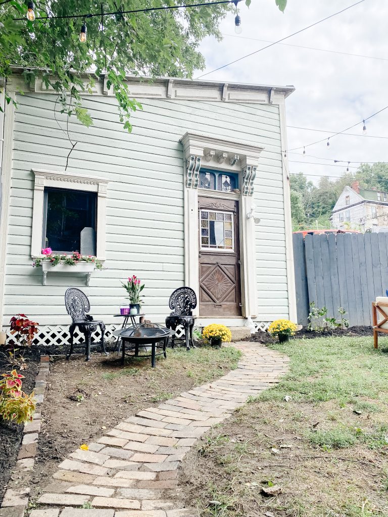
The next stop was the mini house. Thankfully this space required very little beyond a fresh coat of paint. Once again, I chunked a piece of the peeling paint off, took it to Lowe’s to get color matched, and off we went.
Once it was painted, I picked up some lattice and painted it the same color, and nailed it onto the bottom of the house to close the gap between the building and the ground. While that space looks much smaller than Marshall, a groundhog lives under there, and if given the opportunity, Marshall would absolutely get himself stuck under the building in hot pursuit.
Finally, I added a window box to really emphasize the cute factor of the building. I grabbed two decorative shelf brackets from Lowe’s, sprayed them white, and stuck this window box on top. Then, because it was the end of the season, I stuffed said box full of FIFTY CENT petunias and called it finished. Storybook charm- check.
The Design
Once I had the big stuff taken care of, I found myself at a loss for how to actually design my space. For some reason, even though I’m totally comfortable designing inside, outdoor design often evades me.
Luckily, I was able to partner with this really cool online design service called Havenly to design the perfect backyard.
The way it works couldn’t be simpler. You just snap a few photos of your backyard, fill out a design survey that talks about things like how you use the space and what your aesthetic is, and then in a few days your designer sends you a personalized design concept!
This was so cool. We went through just a few revisions, and then once the design was finalized, I got my own curated page of products to shop from. It was like a design rendering meets pinterest. My designer, McKenzi, prioritized seating and lounging spaces, and my love of bistro lights. She helped me identify “spaces” within the yard, and it improved the flow SO much. The best part was every product also had alternates so if I liked the feel of something but maybe not the specific chair shown, it was so easy to find one that fit the design and my taste. After chatting back and forth a bit, this is the concept she came up with.
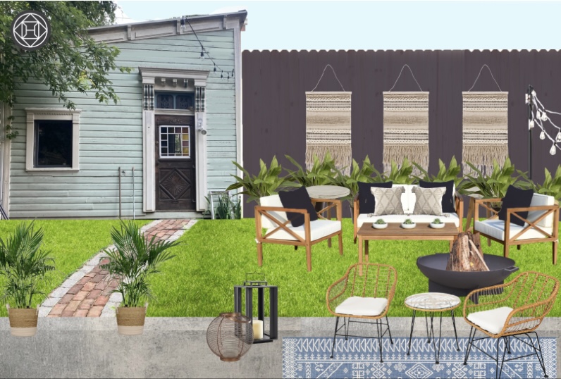
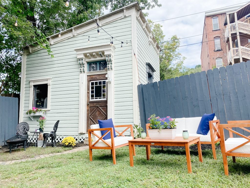
I absolutely loved it. Once we had an idea in place, I got to do the very fun part of shopping for the furniture. Havenly is cool because after we finalized the design, I got a curated shopping list that allowed me to purchase the pieces shown in the renderings, or pick similar items. The conversation set and bistro lights were really the centerpieces of the yard space, so once I had those picked out, everything else just fell into place. I loved the all white look shown in the rendering, but ultimately picked a wood set that would be easier to maintain. This was no problem at all with the different product options provided by Havenly.

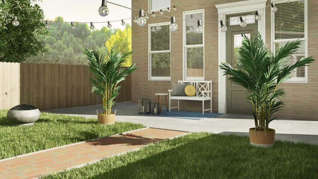
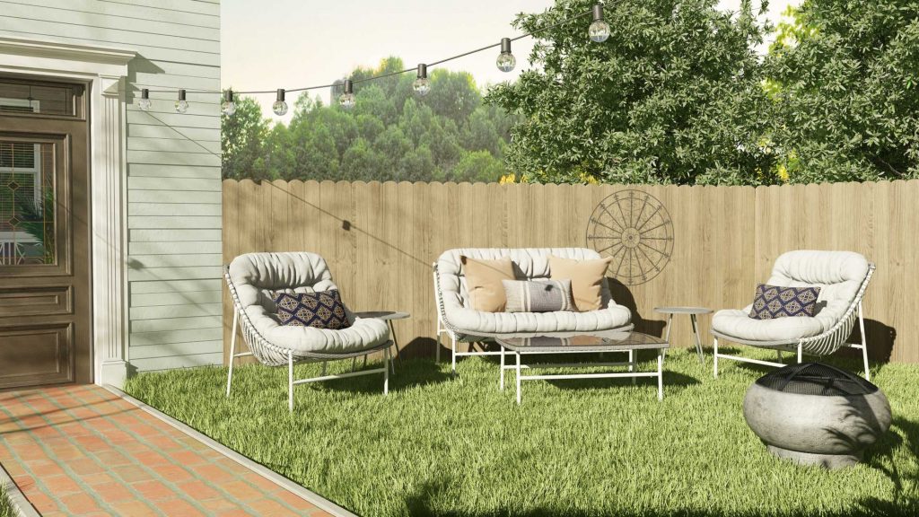
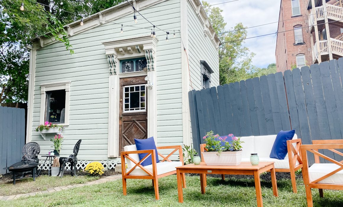
All of this was so helpful, especially since I had a big Labor Day picnic planned. So without further adieu… Here’s the finished space!
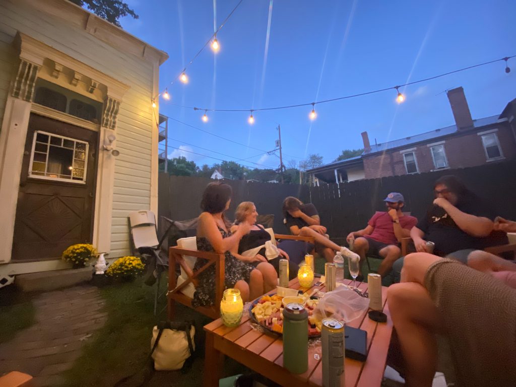
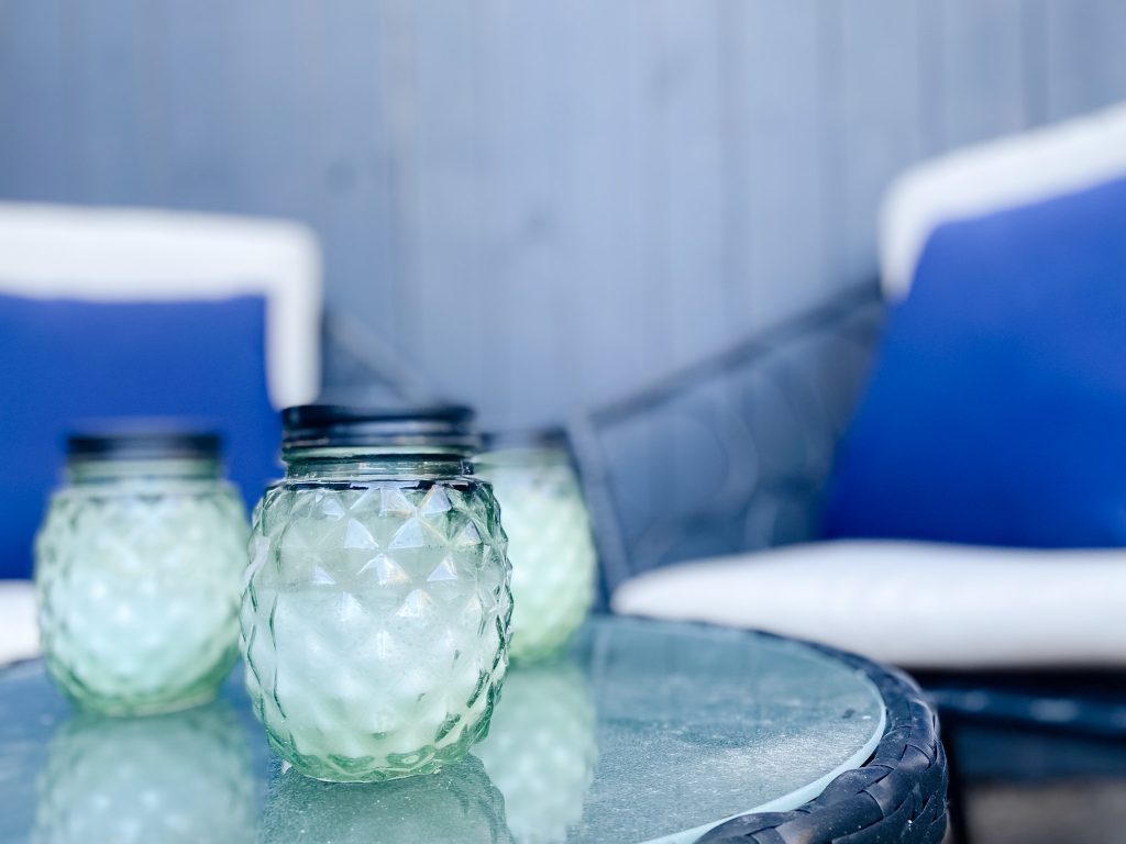
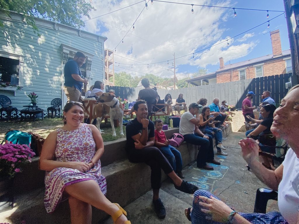
This project could not have happened without the fine folks at Havenly, and I highly recommend checking them out if you need that little extra bit of design assistance!

