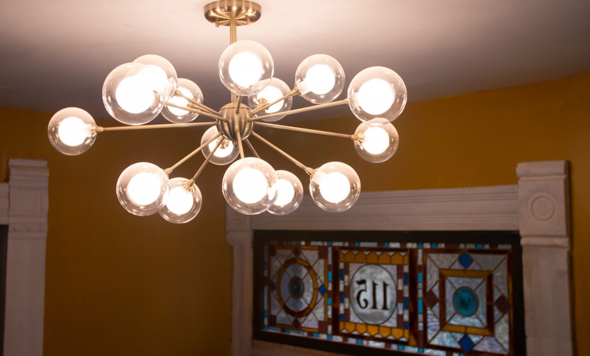
Lighting the Mclain House
For those of you that know my work and have followed along for some time, you know my design philosophy is pretty resolute, for anyone new, allow me to explain.
I love old buildings, I love antiques. I also love modern furniture, folk items, and the occasional target find. When it comes to designing a historic space, I believe it is imperative and frankly, morally requisite, to honor the historic details of your space. That means the character defining features of your building, of the era in which it was built, should stay. Things like floorplan, windows, doors, stairways, fireplaces, tile… basically anything that if you picked the house up and shook it, the things that wouldn’t fall out, should stay. But when it comes to the things that would fall out, like furniture, and the superficial elements meant to be ephemeral, like paint color, go wild. I believe that if you take the time to curate items you love, and appreciate the features of a building that make it what it is, you can create a wholly unique and beloved space.
At the McLain House, this was the approach I took to lighting. I only had one original light fixture in place when I bought the house (it’s in the full bath). That meant I had over a dozen places where I needed to pick a new light fixture.
I partnered with Lamps Plus to furnish the main spaces on my first floor, and I am so glad that I did! Lamps Plus has a huge selection of lighting in all different styles and price points.
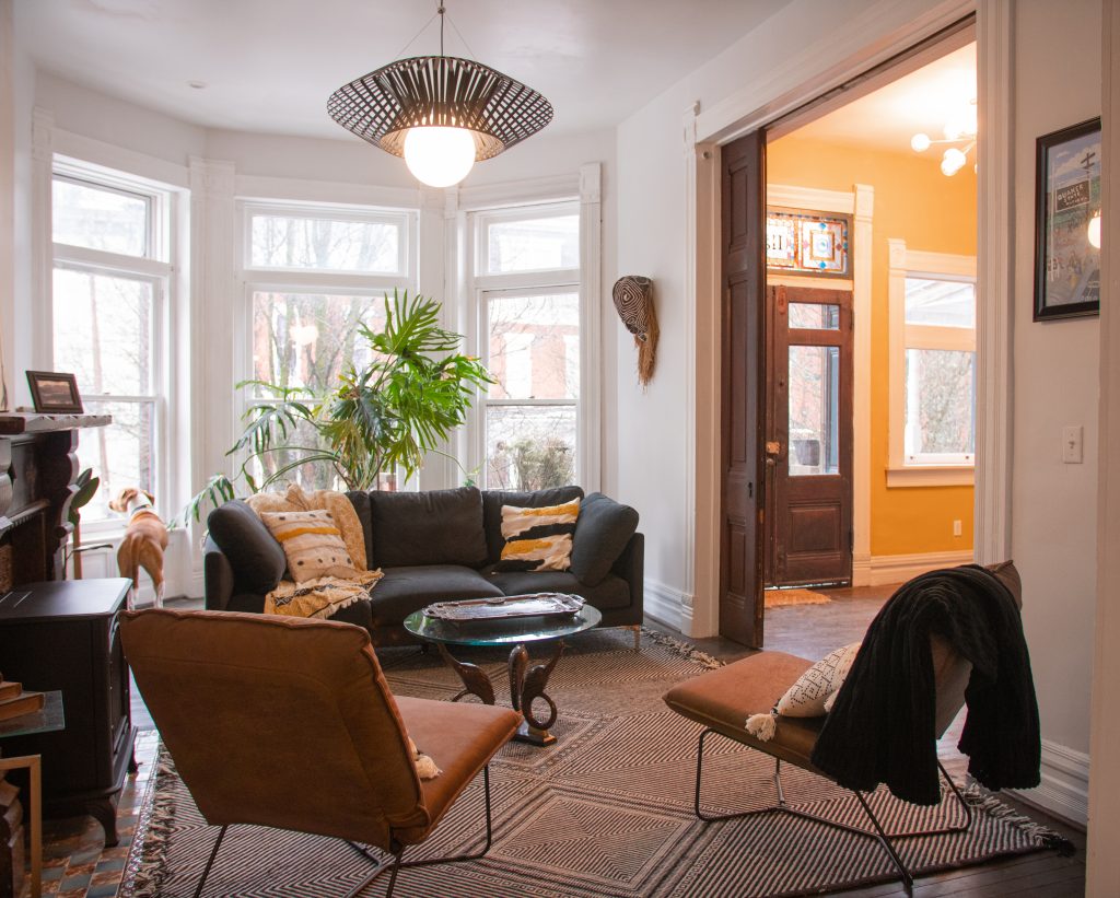
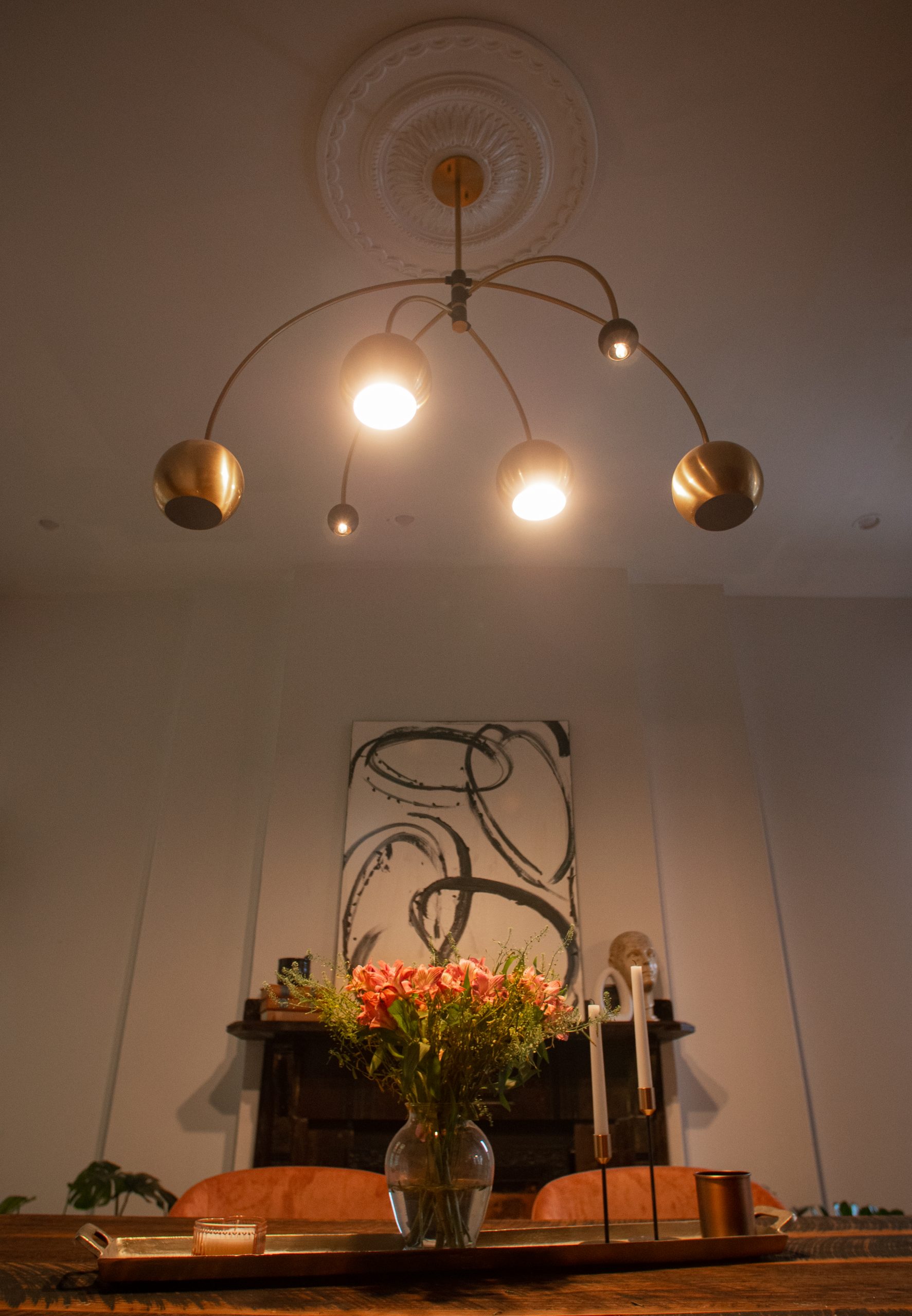
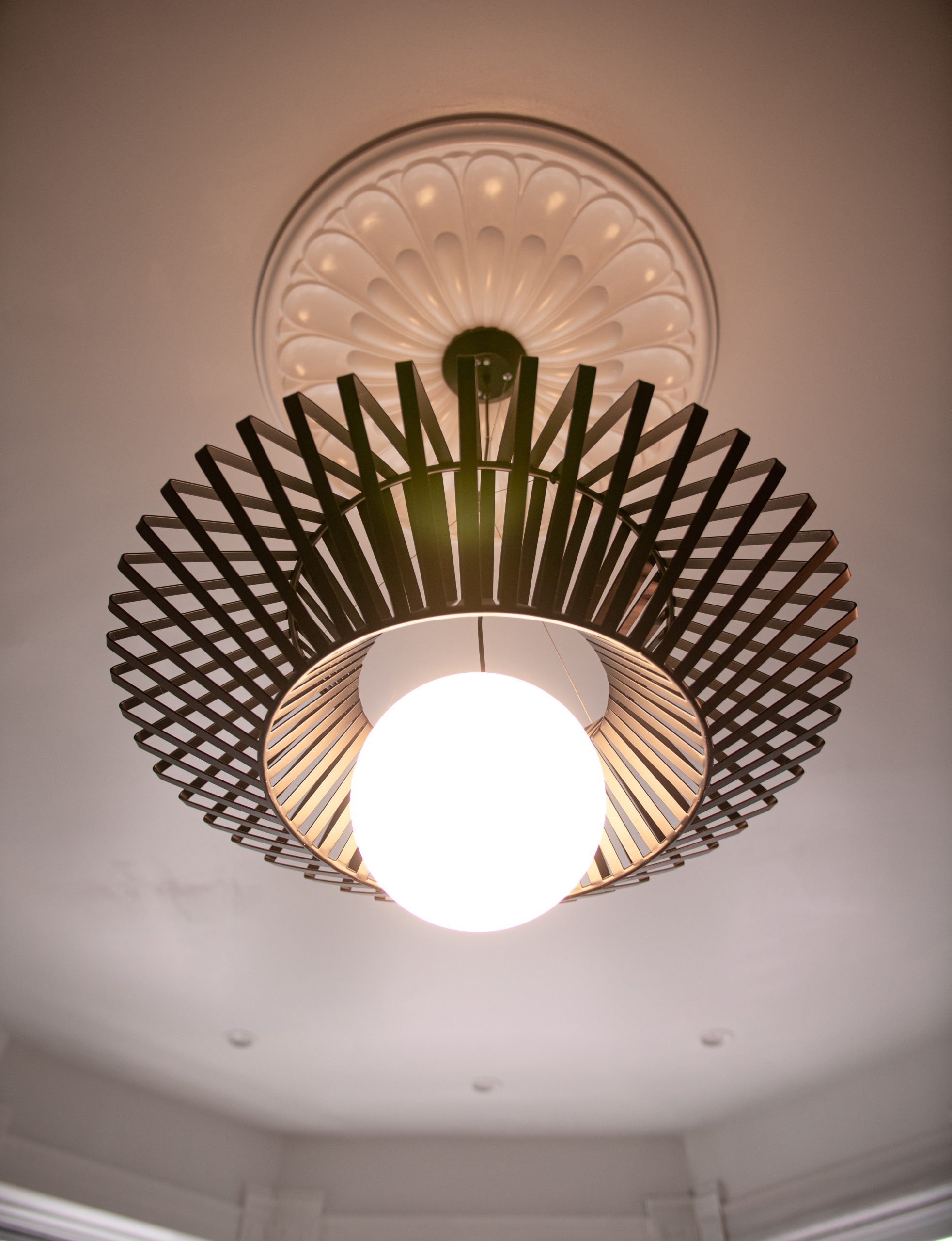
For the living and dining room, I knew I needed fairly large, dramatic fixtures. I personally love modern lighting that feels sculptural, and so that’s what I found! Playing off the black in both fireplace mantels and the brass of my hardware, I went with two extremely modern fixtures. Pretty much anytime I have the choice, when in doubt, I go for brass or black. You really can’t go wrong.
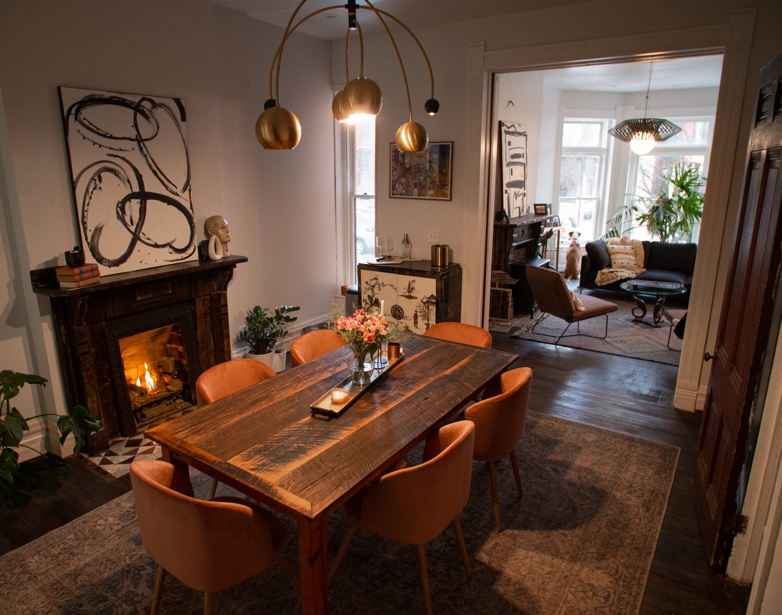
In the stair hall, I knew I needed a bright fixture for the first floor that complimented what I already had going on, and didn’t compete with the second floor. On the second floor, I realized I had a huge cavity to fill, and needed something that was both dramatic, and had the ability to throw some light into the second floor hallway. I chose a play on the classic sputnik design for the first floor, and then a showstopper for the stair cavity. Hanging that massive chandelier was no easy feat (just ask my electrician) but in the end I think it turned out beautifully.
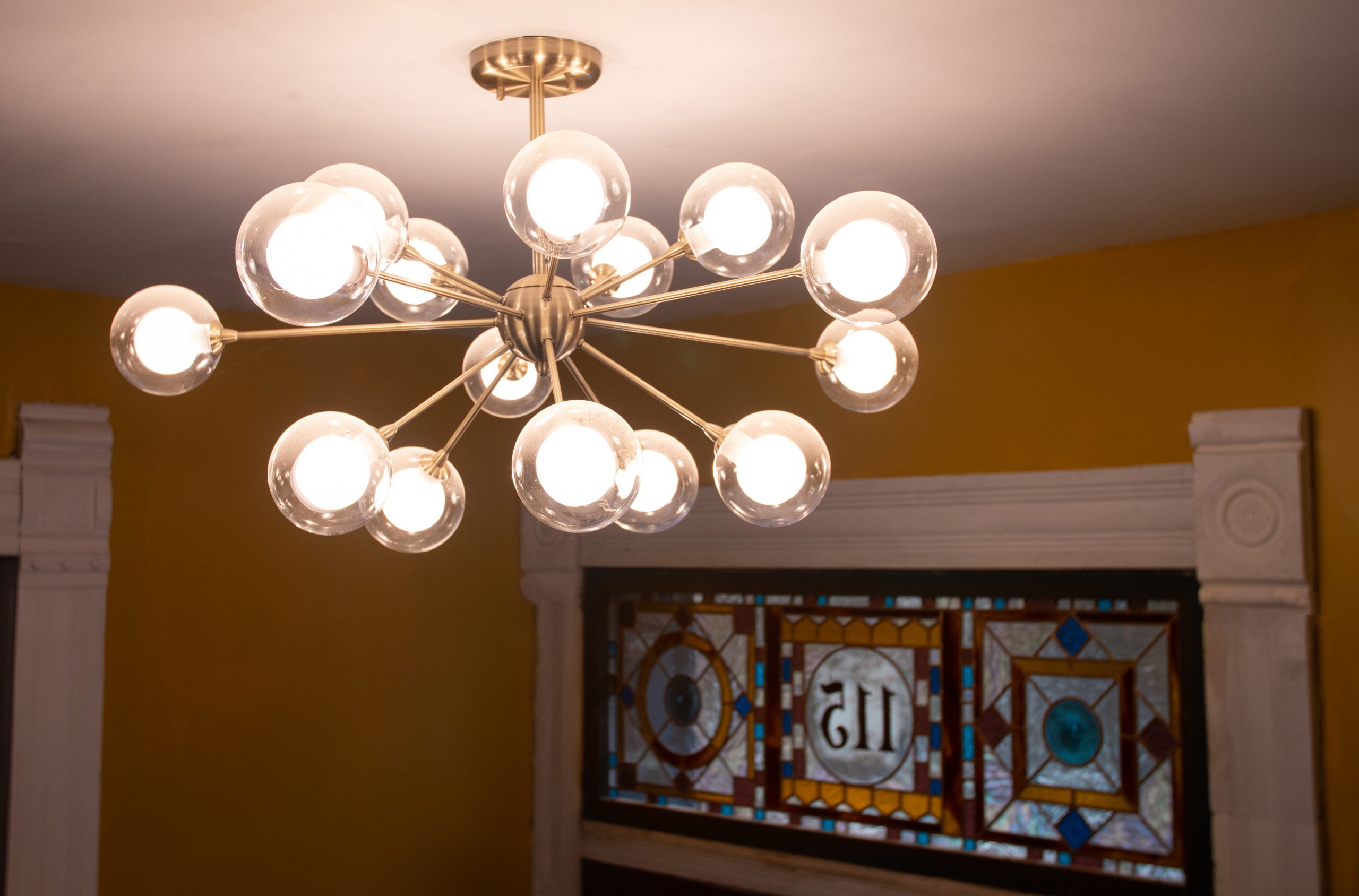
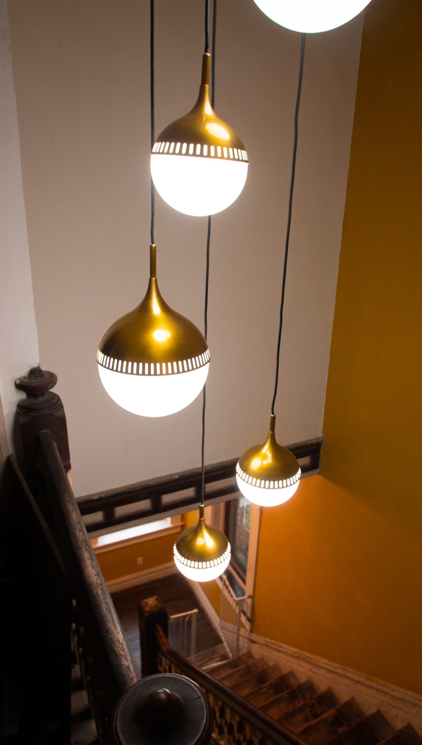
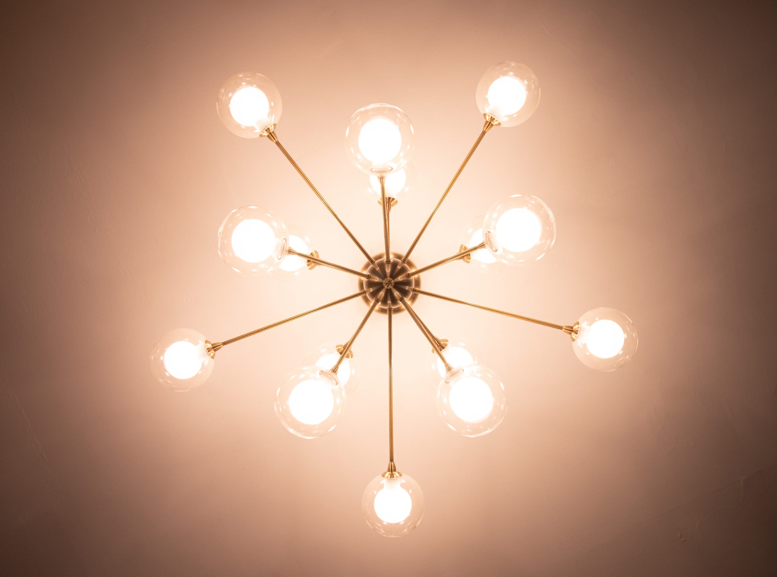
Some of my other favorites throughout the space include the sweet circle sconces I put in the half bath, and the bubbly, soft semi flushmount I put in the bed nook space.
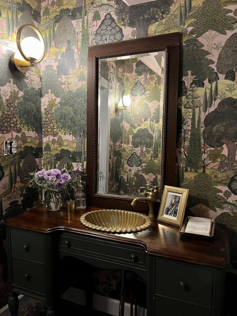
Overall, I am extremely pleased with the products from Lamps Plus, and how well they’ve all been able to fit into my space.
Product Links:
Hall Light
Living Room Lights
Bedroom
Sconces
Dining Room
Hall Chandelier

